Sunday, 9 May 2010
Idea Generation
For negotiated practice I found it easier to create images from a text that I was unfamiliar with because when you work as you read you don't get so concerned about fitting everything in right up till the end. EMP was the first unit I had attempted to include images representing concepts throughout a text instead of just generating a cover design as well as working from a text I had already read once before. The techniques that I used were fairly similar to ones i had used throughout level 5, by skimming through the text and identifying already existing visual metaphors or translating passages of text that were of particular interest to me, sketching out compositionals and reworking before producing the final image. I think I would have found the whole project easier if I had kept better sketchbooks and better organized my developmental work and although I was better at managing my time for EMP I still feel that I need to be more realistic about how long individual tasks are going to take. One thing that I might try in future is to write lists of tasks for a day to break things down.
Other Students
One of my favorite Illustrators amongst our peer group on the course is Jacob Davies. The newspaper he produced for his EMP was both polished and professional looking and inspired me to see the possibility for turning stylized graphic images into the 'cells' of a comic-book style narrative, and also the possibility for me using narrative as a way to communicate 'the message'. This is something i would definitely like to explore post-graduation.
Inspiration
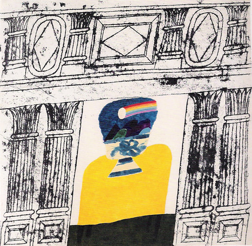
For the most part my inspiration aesthetically for EMP came from the books that I was reading and from their cover design (700 Penguins)
I wanted the Illustrations to shy away from the traditional representational method and tend towards the basic graphic symbolism that i recognized in many of the penguin book covers I had been looking at as well as referencing the imagery from the illustrated books i associate with my childhood and illustrators like Tomi Ungerer - Flat Stanley was one of my favourite books as a child and Tomi Ungerers illustrations like many other artists will always be subtly and subconciously present in my work.
Aesthetically I think the images that make up my book were successful, they complement each other well and form a coherent whole. However I don't know how well they would fare independently of each other. Ultimately I would like to master the ability to do both.
Carol Summers
One of my favorite artists at the moment is Carol Summers. As printmaking has been my focus aesthetically for the last 2 years of the course it would make sense to compare my practice to that of a prolific printmaker. I feel like I have an affinity with his work mainly because of his highly simplified graphic composition and also because I think it showed me how someone who has been almost perpetually stuck in monochrome could open up to a world of colour. One of the ways I made more complicated compositions in the past (e.g. IOT and PC unit) was to make recordings and then manipulate and assemble them digitally but this took away the pleasure of having a 'living' piece of work in the real world with depth and texture. I have now realised the potential that block printing has to overcoming this problem by allowing you to create composite images without having to go anywhere near a computer. During this EEE unit I have focused a fair amount of time to developing my work further in areas i believed it to be lacking which includes making preparations for an ambitious multi coloured woodcut print to show at the free range exhibition. I have produced 3 testers that will eventually be combined with a number of others to make a single print.
It is difficult to evaluate my practice/ identify areas for improvement when comparing my work to Carol Summers work when the peak of his career took place in the 1960s and for the most part his work was displayed and sold at exhibition. This while it is becoming more common for illustrators to exhibit work in galleries for the most part making a sustainable career in illustration comes from other avenues (although as I have written already I hope to sell work independently through my website).
Portfolio
I have been designing a layout for my website and have bought the web domain 'www.adamtaylorillustration.co.uk' but haven't felt inclined to rush the process and put up something I won't be happy with. I have a logo/ hand generated type header for my website finished (see below) as well as a completed font design and roughs for the layout in adobe Illustrator. I want the website to reflect the hand drawn and influences from counter culture that are present in my work, and it is important that I maintain continuity with regards to a visual identity for my promotional materials. In the meantime I have put together a PDF document with 10 pieces of selected work to serve as a digital 'portfolio' until the website is up. I have included examples of figurative drawing, color, print, and hand generated type. As the bulk of my experience up until this point has been in publishing illustration I have chosen pieces that I think would most interest a publishing art director looking for a new freelancer, this i have based loosely upon the 5 images I had to select and submit in order to get an internship at David and Charles publishing house last summer. I will most likely have the website up and running in time for the free range exhibition.

EMP Work


I am overall pleased with my final outcome from the EMP unit, however, like with each one before it; it has undoubtedly been a learning experience and I am sure that if I were to undertake the same task again things would improve. Although I planned to make a book from the beginning I do regret not making something which would have a bigger Impact in a gallery setting, I would also have liked to use my remaining time to break comfortable habits with regards to format. Although I managed with a number of the prints and drawings to begin to incorporate a limited palate of colour ( The mostly tonal/ monochromatic nature of my work has been mentioned in criticism during tutorials) the compositions still remained fairly basic. Were I to tackle the problem again I would most likely work on a larger scale and size the images down for re-printing through art book printing companies like 'blurb.com' and others that have been used by other students on the course. Although there is definitely something to be said for the tactile quality of presenting originals in a handmade book, it also proved quite limiting in terms of what could be realistically included.
Saturday, 8 May 2010
Exhibition

For the EMP unit my final piece was presented in book format, and I realize now how difficult it can be to present books effectively in a gallery space. I chose to explore the different ways that I have seen books displayed in the past and try to think of a solution which would be most suitable for our own exhibition. For the Illustration fundraiser that took place in the studio, the art books for auction were shown in table display cases with a glass top. This worked in a situation where there were many articles all complementing each other but is rather too big for my own purposes. The obvious choice would be to use shelving, but in my case to make a single book sized shelf. I have drawn a very basic working drawing of what I intend to make (shown below) I think perhaps that I will try to tie in the display case with the subject matter of the book by painting the spines of various books on the inside to make it appear as if a shelf from the bookshop in Keep The Aspidistra Flying. The front will have a sheet of perspex that slides in and out through grooves in the top and bottom of the case.

Thursday, 6 May 2010
Artist Residencies.
I have been looking into the possibility of applying for an artists residency for my next step towards a career in printmaking/ illustration. The most suitable I have found so far was for the East London Printmakers studio in hackney:
http://www.eastlondonprintmakers.co.uk/residency.htm
I may have to delay application till 2011 due to accomodation commitments in bournemouth but this should allow me time to develop a stronger portfolio and create work geared specifically for application to such a residency.
I would also at some point in the near future like to apply for a MA in printmaking, I feel that i still have a lot to learn in terms of organizing my thoughts, keeping effective sketchbooks and new practical techniques; but having learned from friends application experience as well as the experience of visiting lecturers it seems it is often advantageous to get a few years of practical experience outside of education before entering into an MA programme.
Font
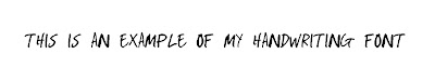
As part of developing my own visual identity I decided to try and develop my own font from my handwriting for using in Photoshop and Illustrator. I felt like this would help to make any promotional materials I send out or my website feel a little more personal while saving me the time of having to write things out by hand and scan them in. I Chose to use a piece of software called fontlab studio and since using this once can now see the benefits of learning what I have learned, especially as far as creating and selling fonts is concerned.
Print Gocco

One of my main aims post graduation was firstly to think of a way to make my work realistically profitable and also to try and continue making prints. Having found it difficult to get access to print studios in the past and knowing how expensive it can be to book time in open studios I felt that it would be prudent to try and be as self sufficient as possible, at least to start off with. Although I can make woodcuts at home in a limited run using the tools I already have, I thought it would be worth looking into another home print solution which would offer a higher quality finished product as well as an option which saves time and labor. I was told about 'print Gocco' machines by a friend, and essentially they are compact self-contained screen printers which enable you to expose/ register/ and print all using the same unit. Having explored the various options offered by the company I chose to order one of these machines from e-bay and will have it in my possession by the 8th may. I also chose to source a quantity of self adhesive vinyl which hopefully i will be able to print on and hand out as promotional stickers at the free range exhibition.
I just read an article about a new Illustrator in the guardian - "...promoted himself by sending postcards of his work to various companies, received the commission from an art director for the Guardian Weekend magazine". Seeing as the size of my Gocco printer is B6 (the same as standard postcard) I would like to make and distribute some personalized printed postcards with my contact details.
One ambition I have for my website after graduation is to set up an online shop where I can sell my prints.
Subscribe to:
Posts (Atom)