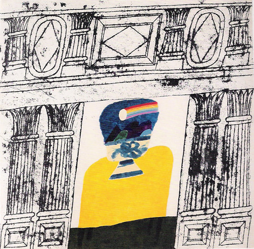
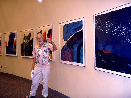
One of my favorite artists at the moment is Carol Summers. As printmaking has been my focus aesthetically for the last 2 years of the course it would make sense to compare my practice to that of a prolific printmaker. I feel like I have an affinity with his work mainly because of his highly simplified graphic composition and also because I think it showed me how someone who has been almost perpetually stuck in monochrome could open up to a world of colour. One of the ways I made more complicated compositions in the past (e.g. IOT and PC unit) was to make recordings and then manipulate and assemble them digitally but this took away the pleasure of having a 'living' piece of work in the real world with depth and texture. I have now realised the potential that block printing has to overcoming this problem by allowing you to create composite images without having to go anywhere near a computer. During this EEE unit I have focused a fair amount of time to developing my work further in areas i believed it to be lacking which includes making preparations for an ambitious multi coloured woodcut print to show at the free range exhibition. I have produced 3 testers that will eventually be combined with a number of others to make a single print.
It is difficult to evaluate my practice/ identify areas for improvement when comparing my work to Carol Summers work when the peak of his career took place in the 1960s and for the most part his work was displayed and sold at exhibition. This while it is becoming more common for illustrators to exhibit work in galleries for the most part making a sustainable career in illustration comes from other avenues (although as I have written already I hope to sell work independently through my website).
No comments:
Post a Comment